
/written content/choice of title...
Magazines typically have a range of conventions, which create the stereotypical image of most magazines. In my magazine I have challenged a variety of similar forms, including; the spacing/appearance of titles, images and the position of these images, use of barcodes, issue numbers, dates etc.


The actual content of the magazine is varied, from interviews with new up coming artists, cat fights because of rivalry music, competition offers and prizes and in depth articles. My double page spread is an interview with Elise Lilly, my fictional character.. from this character I based a life around her and this allowed me to make the interview more realistic and as thought she was actually famous. The article simply features an introduction, which then moves onto the traditional Question+Answer scheme, followed by a brief advertisement featuring the Artists "new book".
 /layout/positioning
In terms of images I think music magazines tend to be quite subtle with the use of images, at least that’s something I noticed in my research. The usual style tends to be really simple and quite spaced out in format. Therefore, I tried to stick to that sort of style and not crowd my page/s with too many images, which could in fact distract from the main interview, main sell line etc. On the main front cover in total; there are only 3 images on the page-this allows necessary space for text to narrate the images and important sell lines which are expected on a magazine anyways.
On the contents page again, a minimal amount of images were used, this was due to actually creating enough room for all my text content. The images used on the content page (5 in total) are all appropriately placed on the page and sized sufficiently for the space in which that topic is given. Two images to illustrate the “HANNI” feature are not only relevant but also give an insight into the article, a ‘preview’ if you wish to what that page is going to focus on/feature.
On the double page spread, obviously a lot more images have been used. However this is totally necessary as any normal double page spread would feature a range/variety of pictures throughout, as too much text would make it overly boring. I created one of the images myself which is used as an alternative “album cover” I used a photo montage scheme to combine text and an image to make the supposedly album cover look professional and also very realistic. I decided to feature a picture of the album cover as I seen this done when I was researching music magazines.


The original basis/genre of music magazine I was aiming for was a house mixed with a pop edge magazine. I feel as though there's a major gap in this type of market for a "house" music magazine, it hasn't been done before and I tried my best where possible to incorporate this possible theme, as I feel it's quite unique and original and also daring to try achieve this type of style.
I found that it was quite hard to base the whole magazine on house music, during the developing process. However, I did manage to fit it in, in places...
My target audience would hopefully listen to music such as the following (Also a pop borderline range)

Question2:
How does your media product represent particular social groups?
 |
| Pixie Lott and Fictional Character "Elise Lilly" |
Question 3: What kind of media institution might distribute your media product and why?
I would want to distribute my magazine in as many popular locations as possibly. Such as; supermarkets, corner shops, kiosks, market stands etc this would ensure it was accessible as greatly possible to the public. It needs to be noticed in order to create a reputation and create a "name" for itself, therefore distributing each issue in these places would create a mass target audience and would ensure that it reaches the right type of people, in which it is suitable for. Situating the magazine in the right place is all part of 'careful distributation', for instance placing the magazine on the stand is one way of getting it to sell and make profit. However, taking it to the next step and situating it next to very popular magazine's would make it more recognisable.
In terms of marketing strategies, the best source of marketing would be to take full advantage of the modern technology of today. So using television advertisements to make sure "Glimmer" was competing with current other magazines; this would also attract a lot of new consumers. Advertising on popular music related websites would make a huge difference to the popularity of the magazine. Advertising the magazine on popular radio station websites like 'Radio 1' or 'Capital FM' would ensure a new band of customers, Glimmer could even create it's own website which could act as an alternative source to accessing the magazine online.
Question 4: Who would be the audience for your media product?
 |
| People who enjoy themselves, have fun and like to party! |
For instance, it would typically be young girls/or boys aged from around 18 to 25 who enjoy house/mainstream music and enjoy spending there spare time taking a further interest into this music, going shopping and generally being regular 'stereotypical' people of this age category.
 |
| Typical group of girls in the 18-25 range... |
Events which would interest my readers/audience would be
local events such as hau5...(seen in the video)
local events such as hau5...(seen in the video)
An example of mainstream music suited to my audience would be the following:
I think these type of people will be highly interested in buying this type of magazine; first of all, because it's so unique and there isn't really a specific, similar competitor out there to Glimmer magazine. Secondly, because it will inform and allow them to develop their knowledge of this magazine much better and to a higher standard (not only enjoyable but inform able). And lastly, because it's new, it's fresh and it's relate-able; if someone has an interest in something they enjoy all things concerned with that (house music).
I found that carrying out a questionnaire contributed a massive amount to discovering my target audience, their likes, their dislikes, how much they would be prepared to pay for the magazine and how it must be affordable to your specific target audience and so on.
Question 5: How did you attract/address your audience?

During this whole project I have used a range of technologies to source and then develop my finished, final magazine.
Photoshop- During the whole devloping process of creating this 'music magazine' named Glimmer, I feel photoshop has been the most useful software possible in terms of executing my magazine in the way I initially wanted it to be. I wasn't too familiar with the software when I began this task and started to use it, although, over time my skills developed and I'm now incredibly comfortable with using this software because I am now familiar with the necessarry tools which are frequently used during the developing process of a task such as the one I was given. In the future, if I was faced with a similar task to a one like this current task I would be a lot more confident initially because I would know what to do with the software and create a much more improved finished piece, In my opinion. The tools I used the most were the dodge/burn/heal/blur tools; these all contributed to correcting unfixed images without correcting them, the magazine would have an unprofessional vibe about it and therefore would lose out on potential customers.

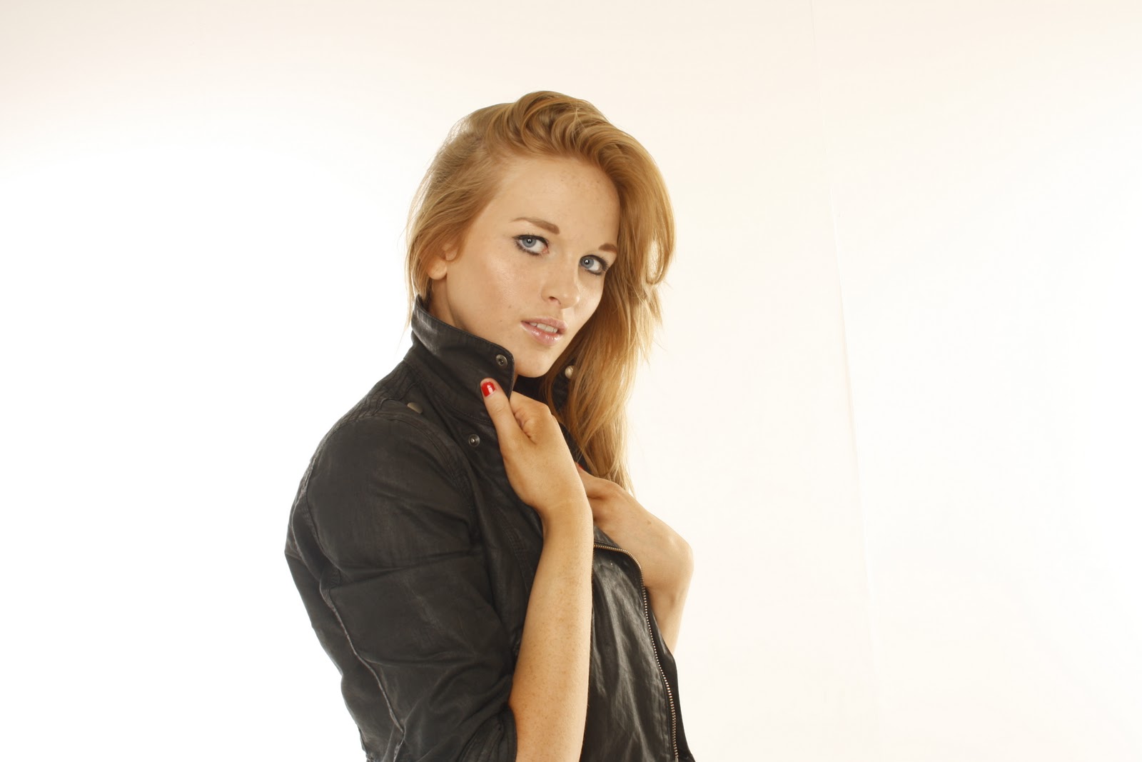
Photography- As I take a photography A-level it was relatively easy to execute professional and realistic ,magazine looking, images onto my 3 pages for my music magazine. In the studio I used a professional SLR camera and shot 'HanniRose' who features in the magazine as a female solo artist, she was photographed in a very gentle way but, with a sort of edge to it by using props such as a leather jacket, and positioning her hair in a tousled, intentionally messy way. These photographs appear professional as though they could be in a real magazine, without the help of professional cameras my magazine wouldn't look as realistic as it currently does.
 |
| With the help of Photoshop I transformed this image so it was made more professional and with the help of tools via photoshop I was able to airbrush places which didn't look very appealing (such as chipped nail polish). |
Blogger- With technologing changing from day to day, devloping in such a rapid way it's important to keep up with it and I found that using this website to represent and display ideas, drafts, homework tasks relating to the project and images very useful. It's different to just using a pen and paper, it's much more unique and makes the whole project much more interesting and it differs from any other project i've had to carry out. I feel like blogger has helped me to present my ideas in a much more undrstandable format, and it allows me to get my point across much more clearly because it allows a mix of content to be used at the same time. Which,I personally found a massive help.
Social Networkintg- Without social networking sites such as 'Facebook' I wouldn't have been able to source most of my images used in my entire magazine. Therefore, technology has a massive impact on my own personal finished magazine to a huge extent. It's not time consuming in the slightest to quickly grab an image from facebook with a right to use it and drop it into my magazine. (very useful in the short+long term)
Question 7: Looking back at your preliminary task, what do you feel you have learnt in the progression from it to the full product? Social Networkintg- Without social networking sites such as 'Facebook' I wouldn't have been able to source most of my images used in my entire magazine. Therefore, technology has a massive impact on my own personal finished magazine to a huge extent. It's not time consuming in the slightest to quickly grab an image from facebook with a right to use it and drop it into my magazine. (very useful in the short+long term)
I feel I have progressed dramatically through making this product. First of all, my skills and knowledge of particular software such as "photoshop" have made a noticeable, positive improvement which, has only been beneficial to executing my final piece.
In comparison to my finished piece, my preliminary task is of a much poorer standard and in my personal opinion comes across too serious. This may be because of the concept I was faced with having to make it relating to a "college" theme, which I found hard to adapt to. In the sense that a college magazine has a much narrower grouping of subject, whereas a music magazine can be filled with a variety of challenging and different topics to interest not only a specific group but a definite range of people.
 |
| Final Pice & Preliminary Intro to the task... |
The Contents page of my preliminary task is slightly better than the front cover that went along side it. However, still it's of a poor quality and looks very amateur. I feel it would be much better if the fonts used were altered to a more unique, yet, professional theme. This would sort of 'spice' it up a bit and generally make it more appealing to the given audience. Again, similar to the front cover... There's a lot of white/blank space which would never be seen in a professional, on the market, music magazine. An image should have been included somewhere of something just to give the contents page a slight range... As the content is basically all text and shapes. Whereas, in my music contents magazine there's a vary of both images, text, sub-headings, and art formats added onto the page by using brush tools through photoshop. The colour scheme on my final magazine is a lot more professional, and unexpected by mixing grey's with pinks and white's with blacks which gives a good contrast throughout.
The above is just a minority of how my weaknesses have turned into strengths and my skills have gradually developed due to; helpful research, peer assessment and personal critical opinions. Overall, I feel I have used my natural ability mixed with new knowledge to develop a final music magazine I am happy, but also satisfied with. I feel confident with new software like photoshop, and I now know how to adapt a "theme" to a product in a positive and hopefully, attractive way.


